Creating Beautiful Visualizations of Educational Attainment Using ggplot2 and ggbeeswarm
Introduction
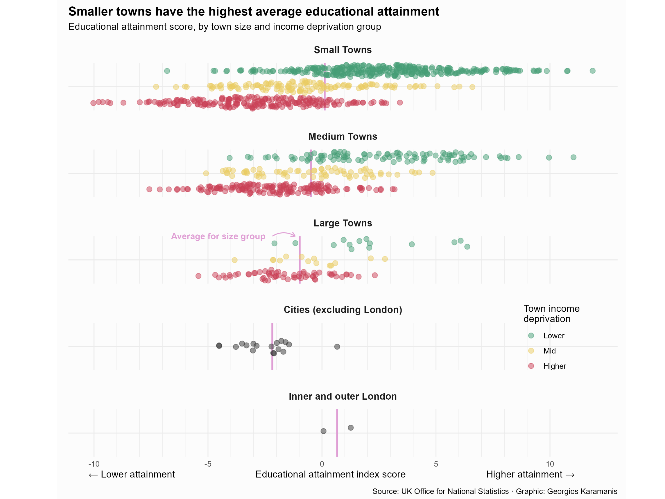
In the realm of data visualization, crafting compelling and informative graphics is an art. In this blog post, we will explore the step-by-step procedure of creating a visually stunning representation of educational attainment scores across different town sizes and income deprivation groups. Our tool of choice for this journey will be the powerful combination of ggplot2 and ggbeeswarm packages in R.
The Story Unveiled: “Smaller Towns Have the Highest Average Educational Attainment”
Step 1: Setup and Data Loading
Before diving into the visualization process, we need to set up our R environment and load the necessary packages. Ensure you have ggplot2 and ggbeeswarm installed. Then, import your dataset containing information about educational attainment, town sizes, and income deprivation groups.
library(tidyverse)
library(ggbeeswarm)
library(camcorder)

# Idea and text from
# https://www.ons.gov.uk/peoplepopulationandcommunity/educationandchildcare/articles/whydochildrenandyoungpeopleinsmallertownsdobetteracademicallythanthoseinlargertowns/2023-07-25

# set the graphic auto save
gg_record(dir = "tidytuesday-temp", device = "png", width = 9, height = 8, units = "in", dpi = 320)

english_education <- readr::read_csv('https://raw.githubusercontent.com/rfordatascience/tidytuesday/master/data/2024/2024-01-23/english_education.csv')
Step 2: Data Exploration and Preparation
Take a moment to explore your dataset and understand its structure. Identify the variables of interest and ensure they are in the right format for visualization. Clean the data if needed.
ee <- english_education %>%
  filter(!size_flag %in% c("Not BUA", "Other Small BUAs")) %>%
  mutate(
    size = case_when(
      str_detect(tolower(size_flag), "london") ~ "Inner and outer London",
      size_flag == "City" ~ "Cities (excluding London)",
      TRUE ~ size_flag
    ),
    income = case_when(
      str_detect(income_flag, "deprivation") ~ income_flag,
      TRUE ~ NA
    )
  ) %>%
  mutate(
    size = fct_inorder(size), # order the names
    income = fct_relevel(income,
                         "Higher deprivation towns",
                         "Mid deprivation towns",
                         "Lower deprivation towns",
    )
  )
Create a summarized median educational score for each London region
ee_size_med <- ee %>%
  group_by(size) %>%
  summarise(median = median(education_score, na.rm = TRUE))
Step 3: Creating the Visualization
Now, let’s move on to the heart of our blog post - the creation of our beautiful visualization. We will utilize ggplot2 for its flexibility and ggbeeswarm for its ability to handle overlapping points gracefully.
f1 <- "Outfit"
pal <- MetBrewer::met.brewer("Klimt", 4)
col_purple <- MetBrewer::met.brewer("Klimt")[1]

ggplot() +
  # Median and annotation
  geom_vline(data = ee_size_med, aes(xintercept = median),
             color = col_purple, linewidth = 1) +
  geom_text(data = ee_size_med %>%
              filter(size == "Large Towns"),
            aes(median,  Inf, label = "Average for size group"), hjust = 1,
            nudge_x = -1.5, family = f1, fontface = "bold",
            size = 3.5, color = col_purple) +
  geom_curve(data = ee_size_med %>%
               filter(size == "Large Towns"),
             aes(x = median - 1.2, xend = median - 0.2,
                 y = Inf, yend = Inf), color = col_purple,
             curvature = -0.3, arrow = arrow(length = unit(0.1, "npc"))) +
  # Towns
  geom_quasirandom(data = ee, aes(education_score, size, color = income)
                   , alpha = 0.5, dodge.width = 2, method = "pseudorandom", size = 2.5) +
  scale_color_manual(values = pal, na.value = "grey20",
                     breaks = c("Lower deprivation towns", "Mid deprivation towns", "Higher deprivation towns"),
                     labels = c("Lower", "Mid", "Higher")) +
  scale_x_continuous(minor_break = (-10:10)) +
  coord_cartesian(clip = "off") +
  facet_wrap(vars(size), ncol = 1, scales = "free_y") +
  labs(
    title = "Smaller towns have the highest average educational attainment",
    subtitle = "Educational attainment score, by town size and income deprivation group",
    caption = "Source: UK Office for National Statistics · Graphic: Georgios Karamanis",
    x = paste0("← Lower attainment", strrep(" ", 30), "Educational attainment index score",
               strrep(" ", 30), "Higher attainment →"),
    color = "Town income\ndeprivation"
  ) +
  theme_minimal(base_family = f1) +
  theme(
    plot.background = element_rect(fill = "grey99", color = NA),
    legend.position = c(0.88, 0.3),
    axis.title.y = element_blank(),
    axis.text.y = element_blank(),
    axis.title.x = element_text(hjust = 0.32),
    plot.margin = margin(10, 10, 10, 10),
    plot.title = element_text(face = "bold", size = 14),
    plot.caption = element_text(margin = margin(10, 0, 0, 0)),
    panel.spacing.y = unit(1, "lines"),
    strip.text = element_text(size = 11, face = "bold", margin = margin(10, 0, 10, 0))
  )
This code creates a beeswarm plot, where each point represents a data point, and the median is visualized as a crossbar. This is a beautiful viz of 3 numeric variables, one numeric variable and a median as a measure of central tendancies. The color aesthetic distinguishes income deprivation groups, providing a comprehensive view of the educational attainment landscape.
Conclusion
By following this step-by-step guide, you’ve learned how to use ggplot2 and ggbeeswarm to create an aesthetically pleasing and informative visualization of educational attainment scores. This not only enhances your storytelling capabilities but also adds a touch of elegance to your data presentations.
Remember, the art of visualization lies not just in the final result but in the thoughtful process that leads to it. Now, armed with this knowledge, go forth and create compelling visuals that resonate with your audience.